logo design
- We’ll sketch and design the best logo for your company. We will provide you with all the files you need. We will create the correct guidelines for using the logo.
- Is the logo not enough? We’ll design a complete style books complete set and design for various print and digital products.
CONTACT US
logo design
what is a logo?
Paul Rand once described a logo as “if in business communication the image is king, then the essence of the image, or the logo, is the jewel in the crown”.
The main purpose of a logo is to present a company to its target audience while differentiating it from its competitors. The logo helps the consumer to determine whether they want a particular product and whether they want that product from a particular brand. A logo is the first impression and communication element a consumer sees.
Every designer has his own system that guides him in designing a logo. Although there are as many systems as there are designers, there are various unifying elements without which a professional logo cannot be developed.
6 golden rules of logo design:
It is impossible to design a quality logo without sticking to proven guidelines, recommendations and past experience. Over time, designers and artists have come up with 6 golden rules of logo design, which make it possible to create a logo that is high quality, visible, recognisable and relevant to your brand.
- simple – the logo must be easily recognisable and clearly convey the company’s message, it must also be able to work in one colour and without too few details
- the right font – the font should blend in rather than stand out, help rather than distract from the rest of the logo
- memorable – the logo must be memorable after just one look
- relevant, original, unique – while logos of related companies in the same sector may contain catchy elements, they should not simply be copied
- modern but timeless – a logo needs to be modern, but not so modern that it quickly becomes outdated
- flexible – the logo must be versatile enough to be used on all platforms (web, print, promotional merchandise, workwear, etc.)
Step 1 - Customer research
The logo is the face of the brand, so it should be as relevant as possible to the message the brand wants to convey to the target audience. Before you start, you need to know the brand’s strategy. The client may already have this strategy in place. In the absence of this, it is important to obtain detailed information about the brand’s mission, values, target audience, business objectives, industry.
If the brand were a person, what qualities would it have? None of these topics is trivial, and it is only by tying everything together that an accurate overview can be obtained. You can then go further and study each element in detail. It is important to remember that designing a logo is a very creative and technically complex process, and this is only the first of many steps.
Step 2 - Competitors
Every industry has competitors who are leaders. There are also unwritten rules about the graphic identity of the industry – different entrenched standards, popular colour palettes and shades, geometric shapes and symbols. Careful research of the sector and competitors will give you an accurate graphic overview and avoid a situation where the logo you design is very similar to another logo in the sector.
It is the designer’s job to understand which elements of the industry’s graphic identity to take into the logo and how far to stray from them. There is no one right answer. It’s a completely creative process, you have to try and experiment. During this process, various details will start to crystallise and everything will start to fall into place.
Step 3 - Psychology
A designer doesn’t have to be trained as a psychologist, but it helps. Our brains are designed to process form visually before anything else (colours, text, language). This is why we often associate a particular shape or symbol with a particular brand (e.g. Draugiem.lv, Twitter, Apple, Nike), even if the logo does not include the name.
Of all our senses, sight plays the biggest role in creating an impression of a brand in our memory. Knowing this, there are a couple of things to consider:
- we need a form to identify an object or a word. The brain is better at recognising shapes that are different, thus better fixing them in memory
- colours are second in the order of recognition. Colours evoke emotions and unique perceptions, but they must be used with care. Some brands are already so tied to a particular colour that the colour is, in principle, brand-specific (Coca Cola, Facebook)
- the brain takes the longest to process text (language, font), which means that this part should be built last
Step 4 - Logo types
It is important to remember that a logo is not a brand, but just one of its many elements. This element is always at the forefront, it has to be remembered as quickly and as deeply as possible. Logos can be complex or simple, and you need to try out all the options to understand which type and elements are best for your brand:
- typographic – the logo is made up of text only, without additional elements (Coca Cola, Canon)
- Initial – the logo reflects only the brand abbreviation or a single letter (Unilever, IBM, HBO, Netflix)
- emblem – a symbol automatically associated with a particular brand (Porsche, Starbucks)
- icon – simplified graphic element (Apple, Twitter)
- abstract symbol – a graphic element that does not evoke an association with the brand name or the product or service offered (Audi, Nike)
Only by creating different versions of the logo in all these variations will the designer and the client be able to understand which solution is the right one.
Every company is unique, and so is its logo. A company is not just about the service or product it offers, but also about the founder’s philosophy, goals and vision.
Step 5 - Sketches
At this stage, the designer’s enthusiasm is at its strongest and the possibilities are endless. The more ideas the better, the freest expression of creativity without any limits. There are no bad ideas at this stage. However, you need to know when to stop, so you need to set and stick to specific targets (maximum number of sketches per development phase).
The sketches are done in black and white and very quickly, without trying to fine-tune the details. The most important thing at this stage is to generate as many ideas as possible and put them on paper. Lack of ideas? Try exaggerating, using similes and metaphors, double meanings, changing perspective.
Step 6 - Practical application
Today, a company can exist on a myriad of platforms and media. Access to different markets is more important than ever, and consumers and partners come from different cultures. Today’s logo needs to be able to work everywhere and be as good in print as it is on a website or app. There are various practicalities to consider when designing a logo:
- how the logo will look in areas of different proportions
- whether the logo only works in black and white
- whether it can be printed on promotional gifts or embroidered on clothing
- whether it is compatible with the digital environment
In our 15+ years of experience, we have worked with logos submitted by our clients, where the practical application was not taken into account at the time of design, resulting in problems with printing or embroidery.
Step 7 - Comments and checklist
To avoid unnecessary complexity in the logo design process, a checklist should be created to guide you. People tend to evaluate subjectively, not objectively. If there is a large team of people involved, it will be very difficult to reach a common denominator. It is imperative to listen to comments from the client and colleagues (as many people as possible) and to summarise all the information gathered, but to remain objective. The checklist will vary for each brand, but may include questions such as:
- whether the logo needs a black and white version
- whether the logo can stand up to the times
- whether it is original and unique
- whether the logo is appropriate to the brand
- the logo will be easily recognisable
- u.c.
The designer must be able to justify the logo to the client. Every detail is important. Each element is included with a thought. Every stroke has a story. Together, they form the face and first impression of a brand.
Step 8 - fine-tuning and guidance
Once the final version of the logo has been chosen, it’s time to polish it to perfection. There is power in the details, and each of them must be polished to perfection – typography, symbols, proportions, graphics, folds, corners, distances, vectors, raster. Zoom in and find all the gaps. Reduce to 100 pixels and see what happens. Once everything is done, the only final step is the guidelines.
The logo must be saved in every possible file format so that the client can easily use it and submit it where necessary. Proper guidelines for the use of the logo should be developed, with all comments, colour codes, distances, visualisations and other technical information.
Designing a logo is not easy, there is no one right answer or process. It is a very creative process that can only be described on a certain level.
customer feedback
We recommend "enivo" as a reliable cooperation partner if the precision and speed of layout development are important.
Akzo Nobel Baltics
marketing specialist
Sarmite Palkavniece
contact us before your visit
Weekdays from 8.00 to 17.00
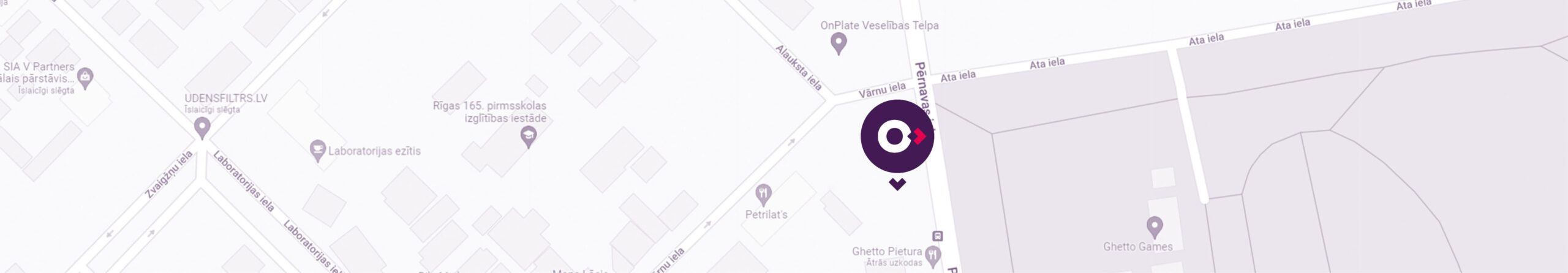
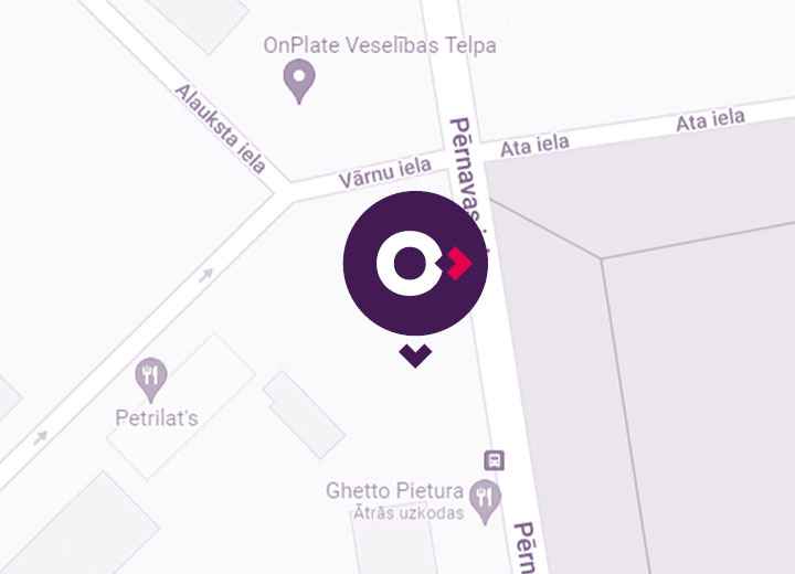
Address: 42 Pernavas Street, Riga, LV-1009, Latvia (easy access to the parking lot from 22 Vārnu Street)
Phone +371 67 278 992,
+371 20 159 890
![]()

E-mail: enivo@enivo.eu
Weekdays from 8.00 to 17.00
Address: 42 Pernavas Street, Riga, LV-1009, Latvia
(easy access to the parking lot from 22 Vārnu Street)
Phone +371 67 278 992, +371 20 159 890
E-mail: enivo@enivo.eu
contact us