
print advertising
- We will create a tasteful design for your company and a precise technical layout for any printed product.
- Prompt and professional print advertising graphic design development in accordance with your company corporate guidelines.
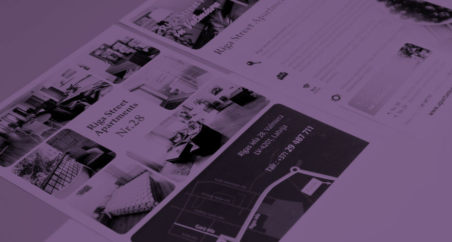
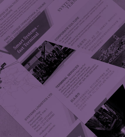
- We’ll create a design for you and layout for everything from business cards to catalogues, packaging and calendars.
print advertising
what is print advertising?
Print design focuses on how the ad will look in print. Even though the design is done on a computer, the final product will always be tangible. It is also very important to be consistent in printed materials – the design must always be in a uniform style, following the brand guidelines (colours, typography, logo placement, etc.).
A well-designed print ad can interest a wide audience in the product or service you offer. It should be easy to understand, with a specific offer and easy to understand how the reader can take advantage of it. Every print ad is different, but to get the most out of it, you need to use all the elements described below correctly.
Title
The most important element of print advertising. The headline is always the first thing you notice in any advertisement. If it’s interesting, engaging and has a twist, readers will start to pay attention to the rest of the ad. Subheadings break this content down in an easy-to-understand way and help direct the reader’s attention. When designing a headline for a print ad, it’s worth following a few principles:
- tell us something useful to pique readers’ interest
- include the most important key words
- avoid using irrelevant, stylish or trendy words
- be precise
What is addressed first in the content of the ad? What is the most important advertising message? Is it the benefits of the product or service, or something else? This is the information you should focus on when creating your headline. Finding the answers to these 6 questions can also help you find ideas for your headline:
- what?
- What?
- when?
- where?
- why?
- how?

images and graphics
Balance is at the heart of everything. Too many or too few images or graphic design elements are bad. Without them, print advertising will be boring, and too many of them will be confusing and distracting. The human mind can more easily perceive one large image than many small ones. If you have a large number of images to choose from, be very meticulous in your selection.
Use images to communicate something important about your company, product or service to the reader. Add an explanation to each image to provide additional context. Post a picture of people using your product or service. Don’t use images that don’t mean anything. Be creative!

basic text of the offer
The body text is the central element of print advertising. Whether the message reaches the reader correctly depends on how it is structured. It must be based on the message to be delivered to the reader. When creating the body text for printed material, it is worth following the same rules that work effectively on other platforms:
- the text (sentences, paragraphs, sections, quotations) must be short and concise
- know your target audience and address them in the first or second person
- keep the text complexity to 10. at grade level, so that it is easy to understand and understand
- provides useful information, avoiding worthless comments and words
- use bullet points, tables, figures, graphics
The main task of the main text is to hold the reader’s interest by shifting it between the different stopping points without changing the overall theme and feel of the message. Organised text will help the reader get to where you want to go.
There are many successful examples of how the text of a report has achieved and exceeded the expected results. The world’s best writers can captivate millions of readers with a few sentences.

CTA (Call to Action)
The purpose of a CTA is to encourage the reader (through text, images, content) to take a specific action – call, buy, send an email, sign up, click, etc. Print advertising has slightly fewer CTA opportunities than digital advertising, which should be taken into account when designing and building the ad. However, this does not mean that print advertising is less effective than digital advertising – each type of advertising has its advantages and disadvantages.
This may seem obvious, but print advertising should not forget to indicate how to contact the company or where to buy the advertised product or service. This information should be as short as possible and easy to remember, as it will not be clickable.

placement of advertising
There is no point in print advertising if it does not reach the desired target audience. An ad can have a great graphic design, clever marketing copy and an irresistible offer, but it won’t make any difference if the target audience is not reached. The first step is to carry out data-driven research on which distribution channels are the most appropriate, with the highest potential returns.
There are many possible channels for print advertising, so it is important to understand which is the most appropriate for your target audience before you create it. An ad in a magazine, a leaflet in the letterbox, a sign on the side of a house or a motorway, a sticker on public transport, a billboard in a supermarket – these are just some of the ways you can reach your audience.
customer feedback
contact us before your visit
Weekdays from 8.00 to 17.00
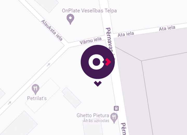
Address: 42 Pernavas Street, Riga, LV-1009, Latvia (easy access to the parking lot from 22 Vārnu Street)
Phone +371 67 278 992,
+371 20 159 890
E-mail: enivo@enivo.eu
Weekdays from 8.00 to 17.00
Address: 42 Pernavas Street, Riga, LV-1009, Latvia
(easy access to the parking lot from 22 Vārnu Street)
Phone +371 67 278 992, +371 20 159 890
E-mail: enivo@enivo.eu
contact us
