What color system is the photo you just took on your smartphone? What will it be like if you decide to print it? What is a pantone, anyway?
We have prepared some material to help you get your bearings and find your way around.
about colors
Colors are very important in visual communication. They can evoke emotions, convey messages and even influence decision-making. Working with color can be tricky, especially when graphic design has to be done in all 3 popular color systems – RGB, CMYK and PANTONE – at the same time. While they all have the same goal – to show colors – each system has its own unique characteristics, advantages and disadvantages.
what is the RGB color model?
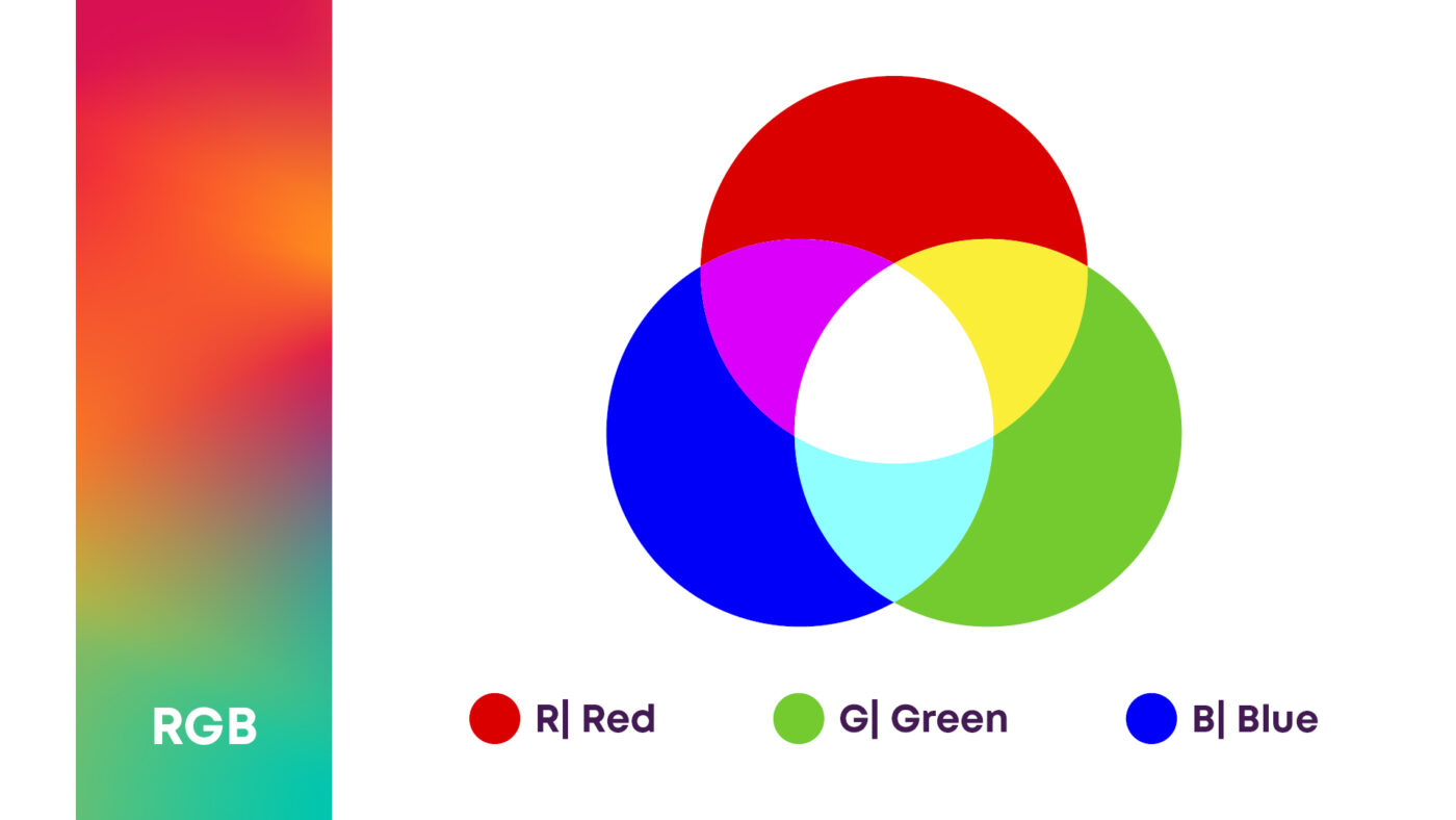
RGB (red, green, blue) is a method for displaying colors in electronic devices – smartphones, computers, TVs, etc. Each such device has a screen made up of small lamps (pixels) that emit light. Each pixel has three light sources – one for red, one for green and one for blue light. The three colors can be combined in different ways and intensities to create millions of other colors. For example, if a pixel has red and green lights on, the pixel will be yellow.
what is the CMYK color model?
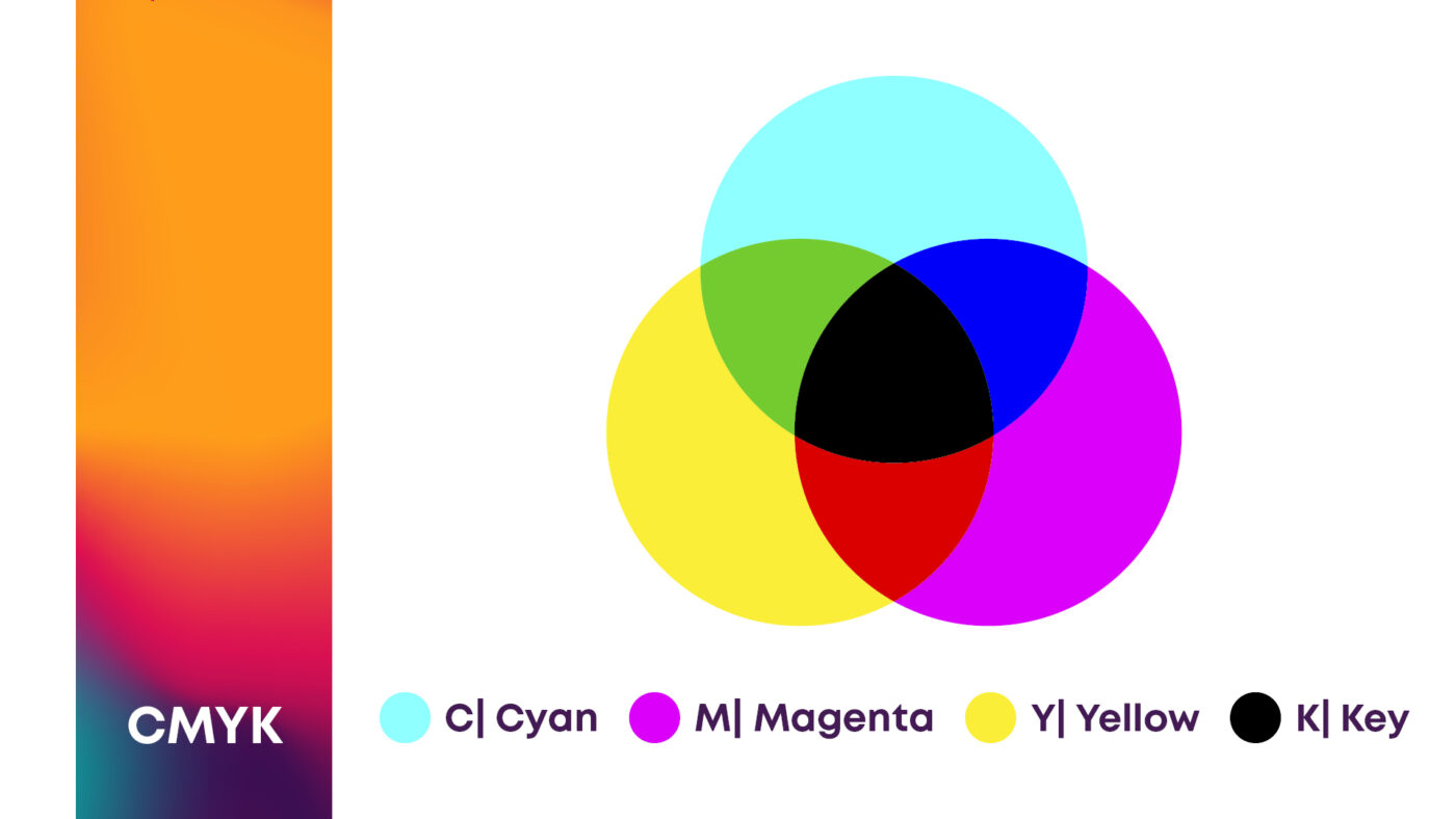
Have you ever heard of CMYK? CMYK stands for light-absorbing inks – cyan, magenta, yellow and black. This color model is used in print. You need an external light source (sun or artificial light) to be able to see the printed result. Mixing these four basic colors in different combinations and intensities results in millions of other colors. Each color is printed on a separate layer, and it’s the combination of these layers that determines the shade you see in the printed material. Whether it’s a professional four-color press or your office printer, you’ll always print in CMYK.
what is the Pantone color model (PMS)?
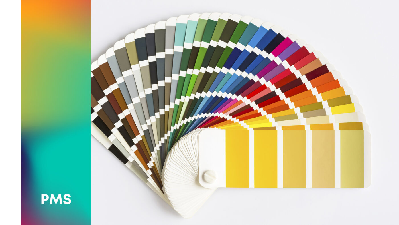
Pantone is a universal colour matching system used in a wide range of industries, but most notably in printing, interior and graphic design, fashion and industrial color mixing. This color model was created by Pantone Inc., giving each shade a unique number. Today, the Pantone color system is used to produce the same shade in every part of the world, because it ensures clear communication between people of different professions in different parts of the world. The Pantone color model is widely used by designers creating logos, brands and marketing materials for companies where color accuracy and consistency are very important.
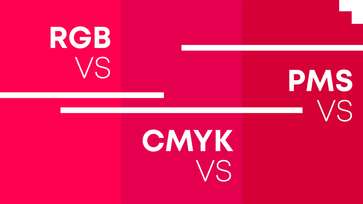
RGB vs CMYK vs PANTONE
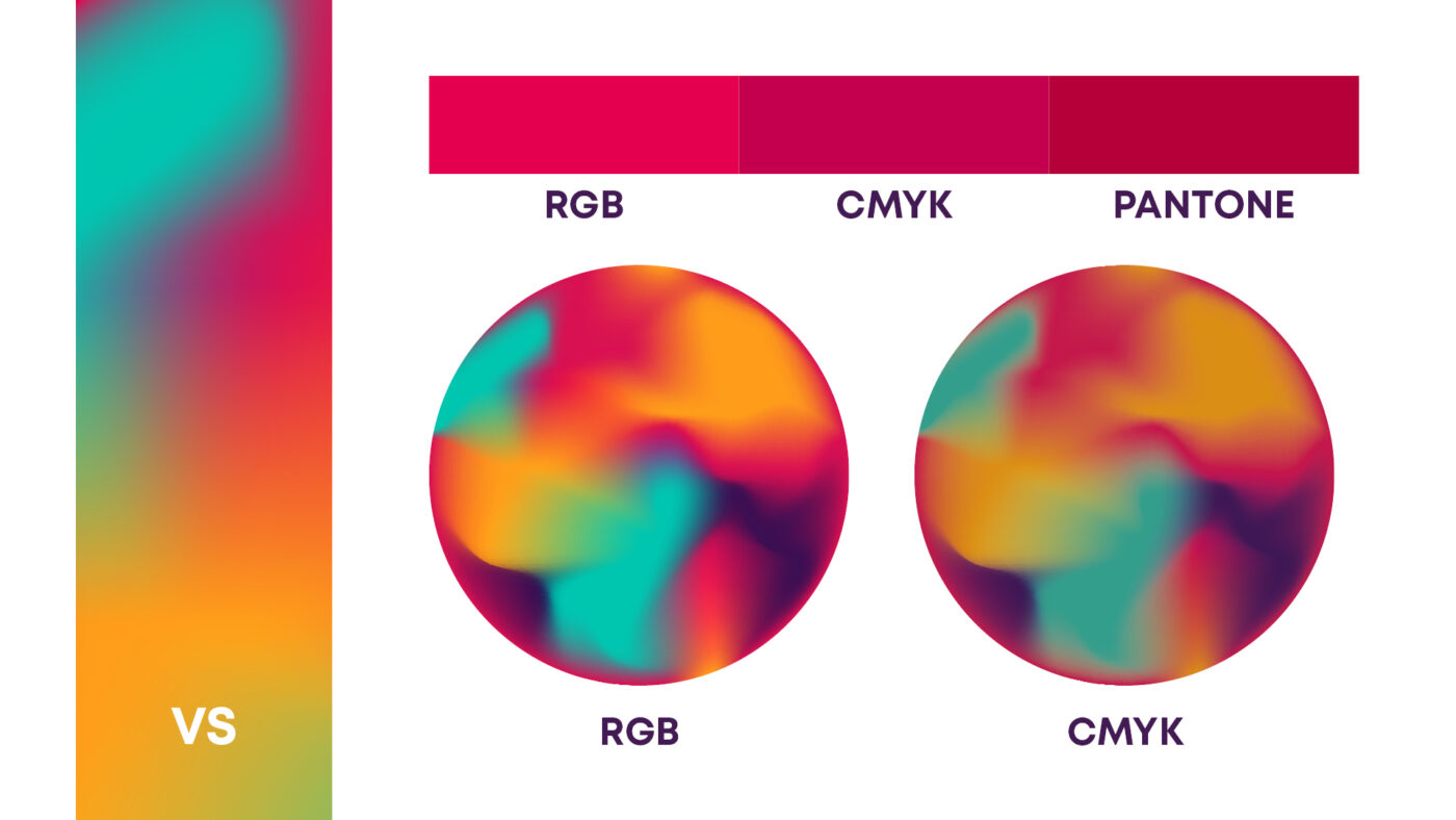
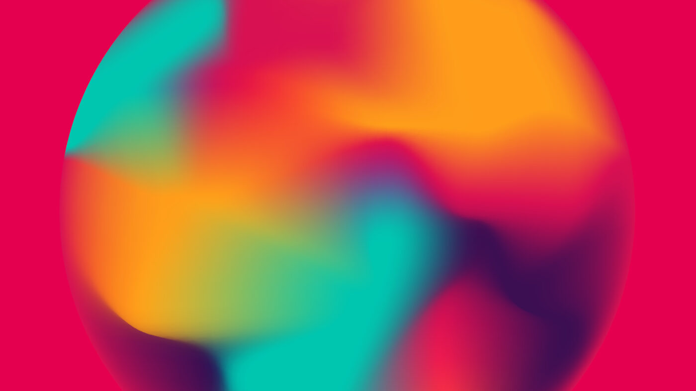
The same image or tint will look different (see image above) in each color system unless it undergoes additional processing. In graphic design, this is an additional challenge for the designer – to make the image look as similar as possible on different media (print and digital). Otherwise, depending on the colors, shades and intensities used, these differences can be very pronounced. Good to know:
- Even RGB can’t represent all available colors, but it’s the closest to what the human eye sees in nature
- CMYK can print fewer colors than RGB, which is further reduced when printing on uncoated (ink-absorbent) paper. This makes printed images look duller than on screen
- PANTONE can print additional tones between RGB and CMYK, but it is usually very expensive and only used for specific tones, not full-color images
Did you find the article useful and would you like to receive similar content in the future? Sign up for our newsletter in your email or follow us on the channel that suits you best – LinkedIn, Facebook, Instagram, YouTube